


Visual Identity, Print + Web Design, Art Direction
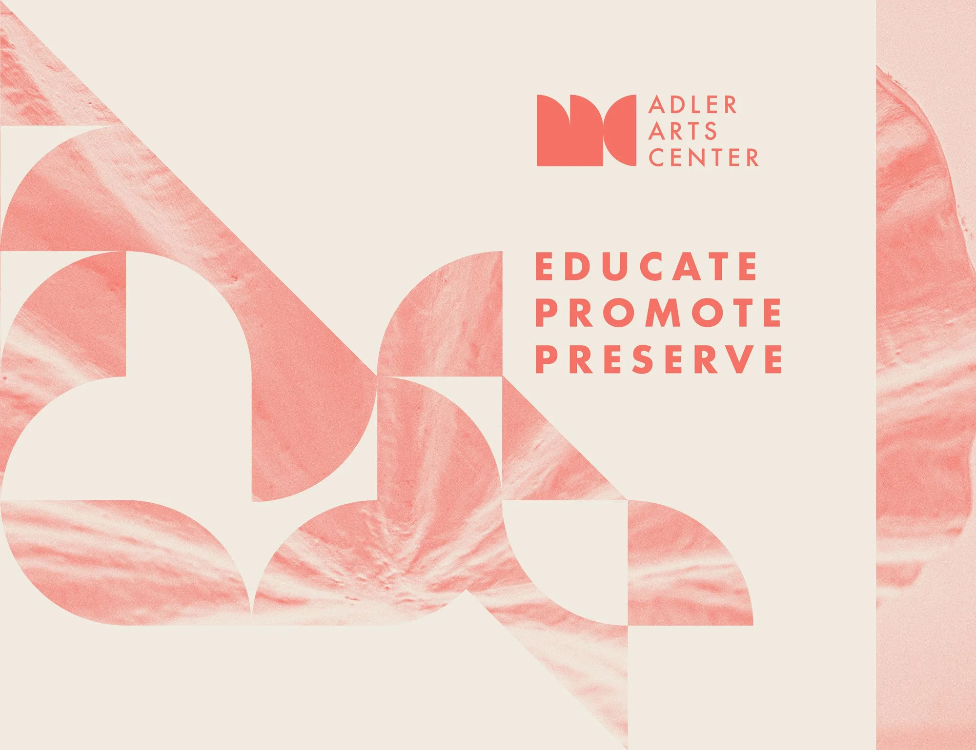
A new direction for an iconic home for the arts (formerly The David Adler Music and Arts Center). The reimagined branding as the Adler Arts Center opens doors to fresh new facets of identity, while uncovering and honoring a long established cultural history. After a period of dwindling relevance and neglect, the center seemingly lost its place in the community, but by building a new comprehensive visual identity around a logo that calls to the center’s mid-century heyday, the Adler Arts Center is reemerging as an exciting contemporary home for the arts with a history that speaks.
The redesigned adlercenter.org uses Wordpress to fit the dynamic content needs of the organization. Site traffic is primarily parents of prospective students and community members seeking information about programs and events, so the focus in structuring content on this site was making it visually engaging and easily navigable.
The audience for these kinds of time sensitive materials is generally familiar with Adler Arts Center, so its an opportunity to stretch and flex the brand a bit artistically while always keeping some key touchstone elements of the brand in place.
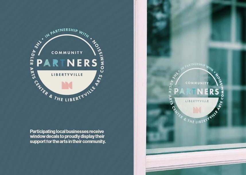
The versatility of the Adler Arts Center brand allows for all kinds of creativity, while still maintaining a strong cohesive brand identity.
Adler expressed the importance of aesthetic distinction for the annual Festival of the Arts event. The Adler Arts Center is the primary organizer and producer of the event, but it’s important that the festival exhibit a defined identity unto itself. The all-caps type treatment is the only brand element that carries forward year-over-year, leaving lots of room for interesting visual themes in future events.